
A Non-Linear Perspective Of Climate Change
SEARCH BLOG: GLOBAL WARMING
The argument over whether or not temperature data reveals global warming or global cooling... or neither... has been raging since the IPCC issued its opinion that the earth was experiencing global warming. The problem is not one of truth versus lies, but a very simple issue of “on what part of the truth are we focusing?”
Global temperature data are notoriously suspect, inconsistent, and discontinuous. Nevertheless, there is ample evidence that during the past 30-40 years, there has been a period of moderate warming. From this evidence, a whole body of scientific and political endeavor has arisen to project the environmental and political risks associated with this warming.

Most recently, a study by The National Center for Atmospheric Research [NCAR] has examined daily maximum and minimum record temperatures and concluded that the U.S. is likely to experience a rapid increase in the ratio of maximum to minimum record temperatures. This was based on approximately 55 years of data.
Following an A1B emission scenario for the 21st century, the U.S. ratio of record high maximum to record low minimum temperatures is projected to continue to increase, with ratios of about 20 to 1 by mid-century, and roughly 50 to 1 by the end of the century.There are two issues with this study beyond the reliability of the data or the analysis of the selected data:
1. What is the nature of our climate?One version of climate is the record of temperatures from 1880:
2. What inference can be drawn by the data used?
 This does not show actual temperatures but variation from a 1901-2000 average. The maximum negative variation is approximately -0.35 to -0.37°C while the maximum positive variation is approximately 0.55 to 0.57°C. Total variation is approximately 0.8°C.
There are two questions that must be asked regarding these data:
1. How do these data reflect longer term changes in climate?A third and somewhat more difficult question to answer is how reliable are the readings through time.
2. How do these data compare with other measures of climate change?
First, these data represent a construction of global temperature anomalies. These may or may not be accurate within the total variation given the ever-changing technologies and methodologies, especially on a global basis. But, for the sake of argument, let us presume they are accurate to the extent claimed.
If we compare those data to the U.S. record, we find a somewhat different pattern.

Given the fact that, numerically, the U.S. stations account for the majority of the worldwide stations, we can attribute the differences to either global versus regional climate variation or, possibly, inferior global estimates of temperature. The pattern variations are distinct. [Source]
Rather than attempting to focus on global estimates of temperature variation from a mean, this will focus on the U.S. record and the implications therein.
 Looking at the trend of the U.S. data, we see a nice coincidence of about 0.8°C upward for the period.
Therefore, it appears that the U.S. record is consistent with the global record. But before drawing that conclusion, we may want to look at a different trend line.
 While unmistakably upward overall, we now see a variation… cyclical variation occurring about every 70 or 80 years: trough to trough and peak to peak.
Still, it can be argued that the overall trend is upward. That is a correct statement based on the data encompassing 1880 – 2008. The question that should be asked is whether that period is either sufficient or representative to draw any conclusions. There is a strong hint that something else is occurring.

Suppose we break up the approximate 130-year timeline into segments.
While not perfectly periodic, there is a startling symmetry to the data that is not seen in the linear trend line. In fact, one might question whether there was a larger process occurring than a simple, general warming trend. Of course, without additional data we can only speculate, but let us indulge ourselves with some speculation.
 What if the temperature anomalies were part of a larger cyclical or oscillation externally-driven process? What if the longer-term data looked more like this?
There is no doubt that the selected data are trending upward, but the question is whether the data are representative. It has been generally recognized that there is a cooling occurring during this decade and scientists from around the world are beginning to warn of a continuation of this cooling – a pause in global warming for as much as 2 decades. That’s another coincidence?
 Let us examine what happens to trend lines in an oscillating or cyclical process based on when the trend analysis begins. If we select a low point in the value range, we are assured of a positive trend line regardless of the number of cycles we analyze.
 If the 1880s and 1890s represented a cold period in the U.S. temperature history and the 1860s and 1870s were warmer, we might have a somewhat different view of our climate history by changing the starting point a few decades.
If the general period between 1850 and 1880 was warmer than the subsequent period… and the coming period is generally cooler than the last two decades… then it is obvious, from the trend line, we are experiencing long-term regional cooling… or even global cooling.
The problem with data going back to 1850 is that it is difficult to determine what is really good data, especially on a global basis.

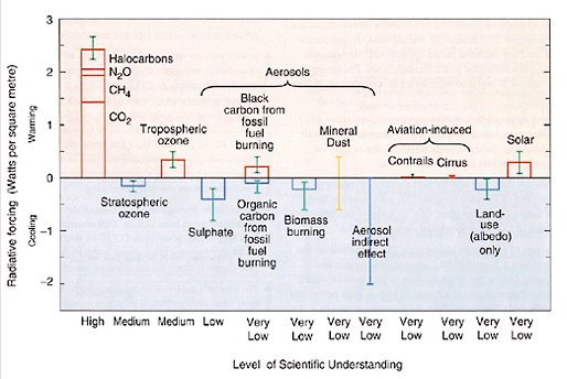
These charts were part of a 2004 presentation by Michael E. Schlesinger and Natasha Andronova; Climate Research Group; Department of Atmospheric Sciences; University of Illinois at Urbana-Champaign. I contact Professor Schlesinger who indicated that they were not his own data, but kindly referred me to this source.
These charts show a distinctly cool period for the average global temperatures during the 1850-1920 period.
In July 2009, Steven McIntyre published the chart CRUTEM3 Zonal which shows distinctly different patterns.
Why the difference?Note in the chart above that the uncertainty for the 1850-1880 period is greater that the variation between 1880 and 2000.
by Steve McIntyre on June 9th, 2009
Here is a puzzling comparison of two zonal averages from Phil Jones' CRUTEM3 gridded land data. Red shows the average from 20S to 20N and black shows the average of the 20-30S band (both N and S). These are calculated from gridded data at hadobs.metoffice.com/crutem3/data/CRUTEM3.nc.
I did this comparison because I noticed a difference between my own average of 20S-20N gridded data and the archived "low latitude" average (which was 30S to 30N)Figure 1. CRUTEM3 Zonal Averages. Black 20-30 N and 20-30S. Red. 20S-20N. The range of differences goes from -1.7 to 4.6 deg C. Explanations welcome.
It is generally accepted that the world was coming out of a little ice age around 1850.
The Little Ice Age was a time of cooler climate in most parts of the world. Although there is some disagreement about exactly when the Little Ice Age started, records suggest that temperatures began cooling around 1250 A.D. The coldest time was during the 16th and 17th Centuries. By 1850 the climate began to warm.Yet this 1924 publication has a different perspective of the 19th century… virtually no change between 1800-1870.
During the Little Ice Age, average global temperatures were 1-1.5 degree Celsius (2-3 degrees Fahrenheit) cooler than they are today. The cooler temperatures were caused by a combination of less solar activity and large volcanic eruptions. Cooling caused glaciers to advance and stunted tree growth. Livestock died, harvests failed, and humans suffered from famine and disease. [Source: UCAR]
 [click image for larger view]
Let us presume that prior to 1880 data was relatively poor and that the 1883 eruption of Mt. Krakatau affected weather for several years in the 1880s. Eliminating data from the 19th century and only focusing on the 20th century with the possibility of cooling for the next two decades… similar to the 1960s and 1970s… we can build a different sort of projection for the beginning of the 21st century.
 While acknowledging a very modest warming during the 20th century from a relatively cold period, we see a recurring pattern emerging and temperature anomalies similar to those recorded between 1800 – 1870.
Dr. Roger Pielke, Sr. suggested one other study of value in this line of reasoning:
An assessment of three alternatives to linear trends for characterizing global atmospheric temperature changesThis paper focus on discontinuous climate periods which change for various reasons. It suggests that among the various alternatives were:
Dian J. Seidel; Air Resources Laboratory, NOAA, Silver Spring, Maryland, USA
John R. Lanzante; Geophysical Fluid Dynamics Laboratory, NOAA, Princeton, New Jersey, USA
Received 3 December 2003; revised 3 March 2004; accepted 26 May 2004; published 29 July 2004.

The stylized cyclical charts shown earlier would be examples of “flat steps.” It would have been just as easy to select the break points to be upward and downward sloped steps during the 20th century.
The conclusion of the Seidel/Lanzante paper was:
Because the models incorporating breakpoints provide reasonable alternatives to linear trends, climate change detection and attribution studies could consider the possibility of using these alternative statistical models, or similar constructs, to compare observations with climate model simulations. In the stratospheric case it seems worthwhile to try to separate the effects of step-like changes associated with volcanic eruptions from gradual changes, which may have different causes. On the other hand, the ratcheting down of stratospheric temperatures may suggest a complex interaction among different processes affecting temperature. For the troposphere the nature of the modeled 1977 upward shift in temperature is unclear, and we suggest that attempts to attribute the warming over the past half century to natural or anthropogenic effects should consider the sloped or flat steps model as well as the traditional simple linear model to describe the change.With this in mind, let us look again at the chart depicting the first 2 decades of the 21st century as a repeat of the 1960s and 1970s, but overlay a pattern of multiple sloped steps:
 Note that virtually all of the warming can be attributed to less negative variance versus the early part of the century. This is consistent with loss of rural reporting stations and general urbanization, not because maximum temperatures have been increasing, and could explain some of the lack of significant negative anomalies in the last half of the 20th century.
We already have some indication of a cooling period beginning. If it does continue, perhaps the declaration of global warming requires additional evaluation.


 From
From 

