READ ABOUT DETROIT AND SOLUTIONS TO ITS PROBLEMS. CLICK HERE.

Saturday, January 31, 2009

Intelligence Without Good Science

SEARCH BLOG: ECONOMY and CLIMATE


The National Review Online has a series of vidoes with Hoover Institution fellow James Woolsey, former Director of the CIA.  This one covers the strategic threat of oil monopolies [oligopolies?] followed by a digression down the bad science of global warming.  Still a good video to watch.  Follow the link above.

Then read this interesting, but not simple analysis of the relationship between CO2 and temperature changes.  Then I suggest Mr. Woolsey do the same, since climate science appears to be well out of his range of intelligence expertise.

..

New Blogs

SEARCH BLOG: MISCELLANEOUS

Some of you may have noticed a couple of "widgets" in the right column that appeared recently.  They are feeds from two of my other blogs: Duh-No! and R U 4 Change.  

  • The first one focuses on stupidity [not stupid pet tricks or Darwin Awards].  
  • The second one is a little cartoon fun at our new president's expense.  It's in a slideshow format in the right column that you can stop and scroll forward or backward manually... or just go to the site for larger views.
I can focus on the foibles and follies around us without adding too much more to this blog.

You can get the widgets for this site just below the title and for the other two just below the feeds in the right column.

..

New Climate Information Resource Site

SEARCH BLOG: CLIMATE


I was recently contacted by the developer of a new climate information resource site, C3 HEADLINES.  This is intended to be a growing repository of news and information published by various sources around the blogosphere.

A particularly useful section is the Charts/Images page with a lot of links to good visuals.  I'd suggest that the information be organized into larger sub-categories as the repository expands, but it is a good start for a site that is only a few months old.

..

Friday, January 30, 2009

Do Extreme Records Favor Earlier Events?

SEARCH BLOG: CLIMATE

Over the past few weeks, I have published various perspectives related to my macro-analysis of the U.S. Climate based on statewide, monthly extreme temperature records.  Rather than use calculated averages and algorithmically adjusted data, this analysis depends on actual records over nearly 13 decades.  The analysis challenged the thesis that there is a widespread global warming as evidenced by the increased frequency of new record temperature extremes.  


With regard to maximum temperatures, the results showed:
  • the 1930s were, by far, the warmest recorded decade

  • the 1990s were no more "extreme" than an average decade

  • the 2000s have been far less "extreme" than most decades
________________________

At the economics blog, Carpe Diem, a discussion about global warming was posted last week.  One of the comments was this:
At 1/20/2009 4:01 PMBlogger misterjosh said...

Bruce, I forgot to mention - the hallofrecord study doesn't pass my gut check. Any measure of records of a given items is always going to favor earlier events.

Let's discuss this "gut check."  The issue has been raised to me before.

In a very short time series, let's say a few years, there will be insufficient opportunity to determine if the data represent low, normal, or high values related to a longer time series.  The "all-time" monthly records require 600 values.  This is 50 states times 12 months.

In one year, there are 600 maximum [and minimum] points established... monthly all-time "records."  
  • These are maximums of all recording stations from 50 states times 365 days of observation:  18,250 statewide daily maximums consolidated to the 12 monthly extremes for the 50 states.  
  • In one decade, the 600 records are based on 182,500 maximums [I'm ignoring leap years.] 
  • In the 129 years of the timeline used in my study, there were 2,354,250 daily statewide maximums used to establish the 600 records... a reasonable "sampling."
The methodology biases the month/year point of the record to the latest incident of the record temperature.  If an old record is tied or surpassed, the record goes to the latest date.  
Because these records are based on absolute temperatures and tie-goes-to-the-latest methodology, there is no favoring earlier points after a reasonable time has passed... and 129 years and 2,354,250 daily observations is more than reasonable.
In fact, the methodology actually biases toward the latest occurrences... because it is a replacement methodology, not an additive one.  
Stated another way, if the number of records that occurred in a year were kept forever as the basis a growing count, then the bias would be toward the earlier years which had the easiest opportunity to set records.  But, because the number of records for a year is reduced when tied or surpassed by a later year as the basis of a constant count, there can be no long-term bias toward early years.
It is theoretically possible for all records to be set during one extremely hot year... simply by tying previous records.  Therefore, every year in the series has an equal opportunity to set an "all-time" record... simply by being equal to or hotter than prior years.
If the proposition that earlier years were favored were true, then one would expect that the highest incident would have been the beginning decade of the 1880s... which happen to have the lowest incident with only 3 maximum records.
What doesn't pass the test is... the "gut check" which was another way of saying that "I didn't really examine the numbers."  I hope "misterjosh" now understands the reason why this is a valid analysis.

..

Thursday, January 29, 2009

Better To Fear The Cold

SEARCH BLOG: CLIMATE


One of the great fears perpetrated on the uninformed by the global warming alarmists is that there is this "doomsday" scenerio where nature goes berserk and we have massive casualties from drowning, drought, famine, and disease.  Soon the world will look like the searing surface of Venus.

The reality is that human being are better suited to heat than cold.  The least technologically advanced humans have lived in the hottest of places with long-term success.  Very few humans have adapted physiologically to cold climates and rely heavily upon managing their personal environments... or perishing.

There is increasing evidence that earth is cooling and it may be for several decades.  Quite simply, many human cultures are not ready for that.  Geologically speaking, there are greater drought areas during cold times than warm times.  There are shorter growing seasons and more likelihood of crop failures.  There is more suffering and disease related to cold weather and more deaths related to individuals being ill-prepared or unable to avoid the effects of severe cold... the poor, the old, and the very young.

Consequently, our government is on an expensive, wasteful, "wild goose chase" to "save the planet"... from the wrong threat.  President Obama has stated his intention to move to more costly and less available "renewable" energy resources and acknowledged that there will be sacrifices to be paid.  The problem is that the sacrifices will go beyond mere financial costs and lead to a situation where more people will die from lack of affordable energy... the very people Obama claims as his constituents.

A simple Google search for "cold weather deaths" gives countless examples.  Here are some:
  1. U.S. Cold-Weather Deaths - New York Times

    Cold weather kills more than 700 Americans a year, according to statistics that were released here this week by the Centers for Disease Control and ...
    query.nytimes.com/gst/fullpage.html?res=9801EFDF1F3AF931A25751C1A96E958260 - 36k -Cached - Similar pages - 
  2. Cold weather caused pelican deaths, officials say - San Jose ...

    Jan 16, 2009 ... Cold weather caused pelican deaths, officials say.
    www.mercurynews.com/centralcoast/ci_11474158 - 56k - Cached - Similar pages - 
  3. Cold Weather deaths on the rise ( The death toll due to cold ...

    Health,The death toll due to cold weather in England and Wales is 25000 as p... This is a seasonal death was mainly because the older pensioners w.
    www.bio-medicine.org/medicine-news/Cold-Weather-deaths-on-the-rise-15390-1/ - 30k -Cached - Similar pages - 
  4. News results for deaths cold weather

    Texas warms up after 6 weather-related deaths - 2 hours ago
    The cold front that brought freezing temperatures wasn't overloaded with ... Authorities were investigating if weather played a role in the death of the ...
    Houston Chronicle - 201 related articles »
  5. Hypothermia - Cold Weather Death

    Jan 3, 2006 ... Information about the dangers of cold weather to seniors. Older people are at higher risk of injury and death due to hypothermia.
    seniorhealth.about.com/od/diseaseasyouage/a/hypotherm_dang.htm - 21k -Cached - Similar pages - 
  6. 8th cold-related death; more cold weather today - Chicago Breaking ...

    8th cold-related death; more cold weather today. December 10, 2008 5:56 AM | 2 Comments. An eighth cold-related death has been recorded in Cook County, ...
    www.chicagobreakingnews.com/2008/12/8th-cold-related-death-more-cold-today.html - 28k -Cached - Similar pages - 
Yes, cold weather adversely affects animals as well. The polar bears are quite safe; it is many other species that are not quite so safe from a cooling climate.

UPDATE

In case you hadn't heard the latest... from CNN:

(CNN) -- A massive winter storm system that left a deadly swath of ice and snow from Texas to Maine pushed into Canada early Thursday, leaving emergency officials to tally the damage.

A tree pulls on utility lines Wednesday in Louisville, Kentucky, in a photo from iReporter Jacek Jasinski.

A tree pulls on utility lines Wednesday in Louisville, Kentucky, in a photo from iReporter Jacek Jasinski.

The storm caused at least 17 deaths and cut power to more than a million homes across the Midwest, according to state emergency management agencies.

While the massive storm dropped sleet and ice across the Mid-South and Midwest, it changed to a snowmaker by the time it reached the Northeast, the National Weather Service said.

Snowfall amounts topped 10 inches in portions of New Hampshire, New York, Vermont, Ohio, Pennsylvania and Maine. Sixteen inches of snow fell on Sunapee, New Hampshire, while Eminence, Missouri, collected five inches of ice and sleet.

The storm left "absolutely everything in northwest Arkansas ... at a standstill," an Arkansas police officer said. 


And as reported in The Detroit News

Inside the abandoned Roosevelt Warehouse in Detroit, a body lies frozen in a block of ice.
Charlie LeDuff on Detroit

Frozen in indifference: Life goes on around body found in vacant Detroit warehouse

DETROIT -- This city has not always been a gentle place, but a series of events over the past few, frigid days causes one to wonder how cold the collective heart has grown.

That just a day after a 93-year old Bay City man was found frozen in his home because he couldn't pay the electric bills

Okay, President Obama, what's your plan to fight Global Cooling and human freezing?

..

Wednesday, January 28, 2009

Bias Toward Recording Higher Temperatures Fails To Produce More Extreme Records

SEARCH BLOG: CLIMATE


The following article appeared in ICECAP, by Joeseph D'Aleo:

United States and Global Data Integrity Issues

By Joseph D’Aleo, CCM, AMS Fellow

image

Issues with the United States and especially the global data bases make them inappropriate to use for trend analysis and thus any important policy decisions based on climate change. These issues include inadequate adjustments for urban data, bad instrument siting, use of instruments with proven biases that are not adjusted for, major global station dropout, an increase in missing monthly data and questionable adjustment practices.

NOAA NCDC USHCN - US CLIMATE DATA

When first implemented in 1990 as USHCN version1, it employed 1221 stations across the United States. In 1999, NASA’s James Hansen published this graph of USHCN version 1 annual mean temperatures:

image

About which Hansen correctly noted: “The U.S. has warmed during the past century, but the warming hardly exceeds year-to-year variability. Indeed, in the U.S. the warmest decade was the 1930s and the warmest year was 1934.”

USHCN was generally accepted as the world’s best data base of temperatures with the stations most continuous and stable, and adjustments made for time of observation, urbanization, known land use changes around sites, and instrumentation changes, each of which can produce major contamination issues for temperature data.

NOAA NCDC removed the urbanization adjustment of Karl et al (1988) in version 2 in 2007. GISS continues to adjust US data for urban heat islands using the satellite determined brightness which categorizes stations as rural, small towns and cities. Here is the latest GISS plot of the US temperatures.

image 
See larger image here.

The difference between the NOAA NCDC USHCN version 2 and GISS shows that NOAA’s new algorithm fails to correct for urbanization warming. In fact the NCDC changes have introduced a warming of 0.75F in the 75 years since 1930. Man made warming indeed but the men are in Asheville, NC.

Read more at the link above.

I find this interesting because if all of the biases are toward higher recorded temperatures, why has there been a dramatic fall-off of new record high temperatures in this decade, as shown in my recent posts? Given these biases, perhaps the real story is that we are experiencing more rapid cooling than has been reported.


..

Tuesday, January 27, 2009

December 2008 Weather Summary

SEARCH BLOG: WEATHER

NOAA summarized the weather extremes for December, 2008 here.

The broad swath of record snowfall [in yellow above] is not a surprise to anyone. The green areas are annual precipitation records... including large amounts of December snowfall.  No global warming drought?

For the full year temperatures...


January may be heralded as the 11th warmest since 1998... do the counting.  Our area in SE Michigan is running about 10°F below normal for the month with only 5 days remaining.  Expect to see some dark blue on the January summary map.


Meanwhile, no relief in sight.


..

Monday, January 26, 2009

Decadal Occurrences Of Statewide Maximum Temperature Records

SEARCH BLOG: CLIMATE

If an increased frequency of extreme temperature records are an indicator of a warming trend... as I have quoted that several times from those who advocate the theory of man-made global warming1 ... then take a look at the decadal frequency of those statewide, monthly records in the animation below.

As explained in previous posts, each state can have only 12 statewide, monthly records for the 13 decades tracked here... hence, they are "all-time" records for a state for a month.

[Note: this animation 1960 data was corrected on 1/31/09]

Graphs 1880s-2000s High Temperature Frequency2
Range goes from 0 [white] to 8 [dark red]. Indiana had the highest frequency of records in one decade with 8 still standing from the 1930s. See the table below for the actual count by decade. Old records are replaced if tied or surpassed by subsequent readings.

The 1930s experienced the highest number of maximum extreme temperatures for which records have not been tied or surpassed subsequently. While the late 1990s did have a very brief hot period associated with El Nino, the 1990s were a rather ordinary period for extreme temperatures in the contiguous 48 states.
I have excluded Alaska and Hawaii from this animation because they are distinct and separate climate zones. For the record, however, Alaska's decade of most frequent high temperature records was the 1970s with 4. Hawaii's decade of most records was the 1910s. Those data are included in the table below.
The 1990s were only particularly hot, as reflected in these records, in New England and Idaho. These selective areas were far more restricted than the geographically widespread heat of the 1930s.

This animation goes to the heart of my arguments regarding global warming as it is reflected in U.S. temperature data.
  • The trendline used by those claiming a long term warming begins in a very cool climate period. Consequently, any trend from that point will be upward.

  • The late 1990s were an aberration and not indicative of the general climate oscillations presented in these records.

  • Click on image for larger view. Updated for correction to 1960 consolidation.


There is virtually no correlation between increased atmospheric CO2 and extreme high temperatures... at least for the continental United States which is where most of the man-made CO2 is supposed to have originated. I challenge those who claim global warming is real to:
  1. Do a similar analysis for the 1880 - 2008 period for the rest of the world... insofar as any reliable data may exist.
  2. Re-examine the notion that the 1880s is a reasonable starting point for establishing a meaningful trend because it appears to have been abnormally cool.
The data above are in direct conflict with those warming claims as it pertains to the U.S. over 13 decades.
Many others have questioned the failure of global warming computer models to fit past data, database "adjustments" to bias the temperature trend upward, and the impact of poorly sited weather stations as they relate to global warming claims, so it is not necessary to go over those issues here.

______________
1 [An example] "These new peaks do not in themselves prove global warming, say scientists - but global warming makes them much more likely. "As you get a warming trend in temperatures, which is what we are observing, the risk of exceeding extreme temperatures increases dramatically," said Peter Stott of the Met Office's Hadley Centre for Climate Prediction and Research." [quoted in The Independent; 19 July 2006]

Sunday, January 25, 2009

U.S. Climate Maximum Temperatures

SEARCH BLOG: CLIMATE

Recently, I showed images of the average record high and low statewide monthly temperature records. It also included small monthly graphs within each state boundary.

Below is an animation of the climate extreme high temperatures by month with shows both the monthly maximum temperatures records [magnitude] and the variability during the months over the U.S. "lower 48" geography. Records range from the mid-60°s to over 130°F. Data tables are shown here.


High Temperature Records Jan-Dec Loop

The image of the data table on which these images were produced is here.

The next cut of the data that appears tomorrow will look at decadal high temperature record frequency, as opposed to monthly record magnitude, by state... in a animation similar to the one above. That will take the original timeline frequency chart posted here and create a geographic look over 13 decades to highlight where, when, and how concentrated the "hotspots" were.

..

Saturday, January 24, 2009

Climate Analysis

SEARCH BLOG: CLIMATE

Tomorrow [Sunday] and Monday, will continue the examination of U.S. Climate based on the tenet that the frequency of extreme temperatures is related to the overall trend of temperatures. There will be some new looks that should be illuminating, maybe unique, and probably controversial.

..

President Obushma

SEARCH BLOG: POLITICS

A brief break from the weather... which is cold... again... still. Speaks for itself....

Friday, January 23, 2009

What Do Extreme Temperature Records Mean?

SEARCH BLOG: CLIMATE

I have been asked what I think the absence of new records mean and I have responded somewhat along this vein:

The extreme hot and cold records represent the boundaries of our climate. The absence of new records indicates to me that the weather is remaining within those historical boundaries even though it may oscillate from the warmer to the cooler side from decade to decade. It also says that our present decade is at most no warmer than the 1930s and late 1990s... or for some reason there is much less variability that allows the calculated average to be higher.
Over the past few days, I provided some data and charts regarding high and low statewide, monthly temperature records for the U.S. from 1880-2008. Yesterday, I spent the better part of the day trying to find a software program that would map that data for me. After several frustrating attempts at various software, I downloaded a trial version of Microsoft MapPoint. It is a bulked-up-on-steroids version of the mapping module that used to be part of Excel. I played around with it for about an hour and through the magic of copying and pasting was able to product the following charts.
This takes the averages of monthly high and monthly low temperatures by state to create relative "climate boundary" maps. There may be other ways of expressing these data visually and I will tinker with that for awhile.
There are some apparent climate anomalies including California which is heavily influenced by the desert south and Hawaii which has Mauna Kea. Still, I think it does give a nice climate boundaries representation of the U.S.

Click images for larger view. You can further increase
the image magnification in the new browser tab by using Ctrl+.
The small bar charts represent the monthly data
and provide both level and variation changes.


Average High Temperature Extremes
Average Low Temperature Extremes
Not too surprising the results. The Southwest has the greatest variability with desert influences and the Southeast the smallest variances with the ocean and gulf influences. One can see the appeal of Florida.

Obviously, Alaska and Hawaii represent unique climates.

..

Wednesday, January 21, 2009

Believing In Global Warming

SEARCH BLOG: GLOBAL WARMING

From Future Pundit:

Poll Of Scientists Finds Support For Anthropogenic Global Warming

A lot of scientists think we are heating up the planet.

A group of 3,146 earth scientists surveyed around the world overwhelmingly agree that in the past 200-plus years, mean global temperatures have been rising, and that human activity is a significant contributing factor in changing mean global temperatures.

Peter Doran, University of Illinois at Chicago associate professor of earth and environmental sciences, along with former graduate student Maggie Kendall Zimmerman, conducted the survey late last year.

The findings appear today in the publication Eos, Transactions, American Geophysical Union.

In trying to overcome criticism of earlier attempts to gauge the view of earth scientists on global warming and the human impact factor, Doran and Kendall Zimmerman sought the opinion of the most complete list of earth scientists they could find, contacting more than 10,200 experts around the world listed in the 2007 edition of the American Geological Institute's Directory of Geoscience Departments.

My comment to that post... be patient:

The vast majority of diet experts believe that caloric intake determines fat content. It seems like common sense until you evaluate body chemistry and learn that in order to have fat increased in fat cells, it must be driven by insulin. In the absence of insulin, the body does not increase fat supplies. Then you must ask the question: how many calories does it take to stimulate insulin production and you find that you have asked the wrong question. It is not fat or protein that triggers insulin production, but carbohydrates. So if you want to lose fat, don't eat carbohydrates.

Now, back to climate. The vast majority of scientists believe [or at least will concede that it seems logical] that adding CO2 to the atmosphere increases the heat content of the atmosphere [increased calories]. However, upon closer observation, it is noted that cold water holds more CO2 than warm water and by heating the water, large amounts of CO2 are released [try it with a carbonated beverage]. The increase of CO2 was an effect of heating, not a cause. More and more scientists are coming to the conclusion that both solar activity and ocean circulation are the primary drivers of climate oscillations... both long and short term. If you want to reduce CO2, you must reduce heating [insulin]; and if you want to reduce heating, you must have a less active sun and cold water ocean circulation [like La Nina].

Causation of bodily fat content and causation of climate variations are not necessarily obvious. CO2 is a by-product, not a cause of warming, which is a by-product of solar activity and ocean circulation patterns. Fat is a by-product of insulin levels which is a by-product of carbohydrate consumption. That's why you can have lower CO2 during periods of greater solar activity and have more heat and rising levels of CO2 during declining solar activity and have less heat [clarification: during the major change points in solar radiation due to the lagging effect of CO2 release and absorption - see here]. That's why you can eat more calories with fewer carbohydrates and not produce more body fat and that's why you can eat fewer calories and much more carbohydrates and produce more body fat.

As H.L. Mencken said:
There is always an easy solution to every human problem—neat, plausible, and wrong.

Henry Louis Mencken (1880–1956)
“The Divine Afflatus,” A Mencken Chrestomathy, chapter 25, p. 443 (1949)

Correlation is not causation.

Since I don't have access to the survey data, I can't allow myself to make a snide comment on how 3,146 is not the vast majority of 10,200 because I don't know how many responded and how representative the respondents were of scientists in general [bias?].

..

Tuesday, January 20, 2009

Strange Weather

SEARCH BLOG: WEATHER

A most unusual looking temperature map....

Especially in Montana.

and now more unusual. As cold in Miami as the northern border of Montana????

..

Extreme Temperature Graphics

SEARCH BLOG: CLIMATE

Yesterday, I provided an update of U.S. Extreme Temperature records. Included were timelines showing the annual summaries of total monthly statewide minimum and maximum records.

For those not wishing to download the Excel database, here are some additional graphics that take the annual summaries to the monthly level. Click on the images to enlarge... you may have to also increase the image size in your browser [Ctrl +].

High temperature records [unchanged from those shown last week]:

Table display
Graph display [This is called a radar graph of the data above... basically a very long line chart that wraps around itself and is good for easy visually comparing a lot of categories (states). You can also spot variability as demonstrated by the states from 3 o'clock to 6 o'clock with similar maximum high records but dissimilar minimum high records. Look at the one state with little monthly variability... you should be able to spot it immediately... and guess which one without reading the headings. It's probably a nice place to live.]


Low temperature records:
Table display
Graph display

If you find what you believe to be an error in the records, please let me know. Otherwise, this is simply nice-to-know information. The real key is the frequency of these extreme records along the timeline... as shown yesterday... to see if there is a change indicating more extremes one way or the other.

..

Monday, January 19, 2009

Where Is The Global Warming... Extreme Temperature Records Update January 2009

SEARCH BLOG: EXTREME TEMPERATURES

UPDATE:

SUNDAY, JUNE 10, 2012


BRIEF EXPLANATION:
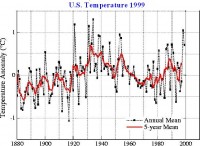
So that you understand what this is about, a few years ago I was looking for evidence of global warming based on the assertion that such warming would be manifested by more extreme high temperatures. An analysis of our local temperatures revealed that most of the records occurred in the 1950s and 1980s, not in the last 20 years. That lead me to search for a more widespread sample... the U.S.

The U.S. analysis showed that the late 1990s were indeed hot and had a greater than normal expected level of statewide monthly records. What it also showed, however, was that the 1930s had a much higher frequency of those records. Finally, it showed a sharp tailing off of such extremes beginning with the new century.
___________________

After reviewing NOAA database summaries and monthly descriptive reports between January 1999 and December 2008, I have completed the update of the monthly, statewide temperature records for both maximum and minimum temperatures.

One of premises of global warming theory is that:
These new peaks do not in themselves prove global warming, say scientists - but global warming makes them much more likely. "As you get a warming trend in temperatures, which is what we are observing, the risk of exceeding extreme temperatures increases dramatically," said Peter Stott of the Met Office's Hadley Centre for Climate Prediction and Research. [quoted in The Independent; 19 July 2006]
These charts summarize the annual number of new monthly, statewide records. There is a limit of 600 maximum and 600 minimum records for this data set... 50 states times 12 months. New records are set and replace old records if the temperature ties or exceeds the old record ... a slight bias toward newer records.

You can download the protected Excel data file. The file has several worksheet tabs at the bottom of the screen. Some data analysis is in hidden columns, but the results are shown. Those are mainly pivot tables. My computer is protected by McAfee Viruscan, Windows Defender, and Malwarebytes Anti-Maleware, so the files should be completely clean.
Click images for larger view. For maximum statewide, monthly records:


For minimum statewide, monthly records:


These graphs are most extraordinary for the 2001 - 08 period because, according to the information available from NOAA, there has been almost a total absence of either new maximum or new minimum statewide records. It is as if 2001-08 was as "ordinary" as possible. There was no evidence of extreme warming or cooling based on temperature extremes.
I was so surprised by the outcome that I double-checked the data and reports. I found only two previously excluded minimum temperature records; Maine, January 1999, -55°F and Utah, January 2002, -62°F. These replaced records of several decades ago. One maximum record for Oklahoma in May 2000 had been reported as 114°F in Weatherford and for some reason was now showing up as 112°F in Altus. I did not change my information because the NOAA daily records did not verify the change in the monthly records... not sure why.
The number of reporting sites vary from month to month in the database for some reason, but the number hovers around 190,000. That should certainly cover the geographic area reasonably well. As far as I can tell, the historical data for these records have not been adjusted upward or downward as has some analytical data used to show an upward trend increase recently... the records are the records.

ADDITIONAL GRAPHS HERE

It looks as if the 1st decade of the 21st century... at least for the U.S.... could be viewed as the most climatically boring rather than among the warmest... anti-climactic? So I ask again: where's the global warming?
The only heating seems to be among the politics of climate... and that may be cooling down.
Looking ahead, it is likely that January 2009 may have at least two new monthly, statewide minimum temperature records... read more here.
ADDENDUM:
Just this week, NWS threw out what would have been an all-time state record for Illinois based on NWS citing lack of confidence in equipment, claiming “ASOS better than AWOS”. Anthony Watts responded in this post ”when we see public information statements like the one yesterday from the National Weather Service telling us that the ASOS system is more acceptable than an AWOS system calibrated just the day before, I’m quite comfortable in calling BS on that statement.”
As long as it works that way on the high side, too.

..

Sunday, January 18, 2009

Not Quite Normal But Better Than Nothing

SEARCH BLOG: WEATHER

The "Polar Express" has moved on eastward with the last U.S. vestige departing northern Maine. Around southeastern Michigan, we will see temperatures about 20° higher than the last few days... still below normal, but higher. By mid-week temperatures are projected to reach about normal highs. It's a good bet, however, that there is no way for this to be anything more than much colder than normal for the month. That would put it... on a Hansen database adjusted level... at about normal, I guess.


Tomorrow, another update to the "Where's The Global Warming" post. Both a summary and downloadable files of record high and low temperatures from 1880-2008 will be available for monthly, statewide extremes. You may or may not be surprised at the latest information.

I didn't realize that it got so cold in Hawaii until last year when my son and his wife sent pictures from the top of Mauna Kea so I wasn't so surprised to see the minimum temperature records for that state. It's a little short of the mid-troposphere, so I guess all of the warming didn't quite get to the mountain top. It's about -3°C there right now... not warm, but not as cold as it has gotten. Still, you can't grow pineapples there. It may not be representative of the islands, but it is a consistent reference point.
Meanwhile, I'll have about 5" of snow to clear from the drive and walkways. It really was too cold and windy to bother yesterday.

..

Saturday, January 17, 2009

Can We Burn The Coal Yet?

SEARCH BLOG: WEATHER

I know we are suppose to fear CO2 and sacrifice to save the planet, but do you think we could burn just a little coal now? Maybe some wood, too? After all, yesterday's daily average temperature was minus 8.5°. Maybe just until the end of January?


How much below our daily average does our actual average have to get before we can say we've done our job?


Oh, maybe I've been too hasty. It looks like it's warming up out there.

Back to looking for the shorts and golf balls.

..

Can"t Find It?

Use the SEARCH BLOG feature at the upper left. For example, try "Global Warming".

You can also use the "LABELS" below or at the end of each post to find related posts.

Blog Archive

Cost of Gasoline - Enter Your Zipcode or Click on Map

CO2 Cap and Trade

There is always an easy solution to every human problem—neat, plausible, and wrong.
Henry Louis Mencken (1880–1956)
“The Divine Afflatus,” A Mencken Chrestomathy, chapter 25, p. 443 (1949)
... and one could add "not all human problems really are."
It was beautiful and simple, as truly great swindles are.
- O. Henry
... The Government is on course for an embarrassing showdown with the European Union, business groups and environmental charities after refusing to guarantee that billions of pounds of revenue it stands to earn from carbon-permit trading will be spent on combating climate change.
The Independent (UK)

Tracking Interest Rates

Tracking Interest Rates

FEDERAL RESERVE & HOUSING

SEARCH BLOG: FEDERAL RESERVE for full versions... or use the Blog Archive pulldown menu.

February 3, 2006
Go back to 1999-2000 and see what the Fed did. They are following the same pattern for 2005-06. If it ain't broke, the Fed will fix it... and good!
August 29, 2006 The Federal Reserve always acts on old information... and is the only cause of U.S. recessions.
December 5, 2006 Last spring I wrote about what I saw to be a sharp downturn in the economy in the "rustbelt" states, particularly Michigan.
March 28, 2007
The Federal Reserve sees no need to cut interest rates in the light of adverse recent economic data, Ben Bernanke said on Wednesday.
The Fed chairman said ”to date, the incoming data have supported the view that the current stance of policy is likely to foster sustainable economic growth and a gradual ebbing in core inflation”.

July 21, 2007 My guess is that if there is an interest rate change, a cut is more likely than an increase. The key variables to be watching at this point are real estate prices and the inventory of unsold homes.
August 11, 2007 I suspect that within 6 months the Federal Reserve will be forced to lower interest rates before housing becomes a black hole.
September 11, 2007 It only means that the overall process has flaws guaranteeing it will be slow in responding to changes in the economy... and tend to over-react as a result.
September 18, 2007 I think a 4% rate is really what is needed to turn the economy back on the right course. The rate may not get there, but more cuts will be needed with employment rates down and foreclosure rates up.
October 25, 2007 How long will it be before I will be able to write: "The Federal Reserve lowered its lending rate to 4% in response to the collapse of the U.S. housing market and massive numbers of foreclosures that threaten the banking and mortgage sectors."
November 28, 2007 FED VICE CHAIRMAN DONALD KOHN
"Should the elevated turbulence persist, it would increase the possibility of further tightening in financial conditions for households and businesses," he said.

"Uncertainties about the economic outlook are unusually high right now," he said. "These uncertainties require flexible and pragmatic policymaking -- nimble is the adjective I used a few weeks ago."
http://www.reuters.com/

December 11, 2007 Somehow the Fed misses the obvious.
fed_rate_moves_425_small.gif
[Image from: CNNMoney.com]
December 13, 2007 [from The Christian Science Monitor]
"The odds of a recession are now above 50 percent," says Mark Zandi, chief economist at Moody's Economy.com. "We are right on the edge of a recession in part because of the Fed's reluctance to reduce interest rates more aggressively." [see my comments of September 11]
January 7, 2008 The real problem now is that consumers can't rescue the economy and manufacturing, which is already weakening, will continue to weaken. We've gutted the forces that could avoid a downturn. The question is not whether there will be a recession, but can it be dampened sufficiently so that it is very short.
January 11, 2008 This is death by a thousand cuts.
January 13, 2008 [N.Y. Times]
“The question is not whether we will have a recession, but how deep and prolonged it will be,” said David Rosenberg, the chief North American economist at Merrill Lynch. “Even if the Fed’s moves are going to work, it will not show up until the later part of 2008 or 2009.
January 17, 2008 A few days ago, Anna Schwartz, nonagenarian economist, implicated the Federal Reserve as the cause of the present lending crisis [from the Telegraph - UK]:
The high priestess of US monetarism - a revered figure at the Fed - says the central bank is itself the chief cause of the credit bubble, and now seems stunned as the consequences of its own actions engulf the financial system. "The new group at the Fed is not equal to the problem that faces it," she says, daring to utter a thought that fellow critics mostly utter sotto voce.
January 22, 2008 The cut has become infected and a limb is in danger. Ben Bernanke is panicking and the Fed has its emergency triage team cutting rates... this time by 3/4%. ...

What should the Federal Reserve do now? Step back... and don't be so anxious to raise rates at the first sign of economic improvement.
Individuals and businesses need stability in their financial cost structures so that they can plan effectively and keep their ships afloat. Wildly fluctuating rates... regardless of what the absolute levels are... create problems. Either too much spending or too much fear. It's just not that difficult to comprehend. Why has it been so difficult for the Fed?

About Me

My photo
Michigan, United States
Air Force (SAC) captain 1968-72. Retired after 35 years of business and logistical planning, including running a small business. Two sons with advanced degrees; one with a business and pre-law degree. Beautiful wife who has put up with me for 4 decades. Education: B.A. (Sociology major; minors in philosopy, English literature, and German) M.S. Operations Management (like a mixture of an MBA with logistical planning)