READ ABOUT DETROIT AND SOLUTIONS TO ITS PROBLEMS. CLICK HERE.
Showing posts sorted by relevance for query Temperature Extremes. Sort by date Show all posts

Tuesday, February 27, 2007

Global Warming Without New High Temperature Extremes?

SEARCH BLOG: GLOBAL WARMING

If increasing frequency of new high temperature extremes is an indicator of global warming, how can such warming be taking place if the expected increase in high temperature extremes is not occurring?

Dr. Scott Robeson at Indiana University is considering further investigation of the historical dataset of high and low temperature extremes to see what may not be apparent in the raw data which was discussed over the last two days. That may take a little while, however.

Any analysis of weather over 120 years has limitations when you start considering the variations in the number of observation sites, the methods for collecting data, and the accuracy of the equipment involved. Thus, it is possible that data from the 19th and early 20th century are not good starting points for a dataset of temperature extremes. Of course, the same objection could be made regarding the calculation of average temperatures which is far more complex and, on which, claims of global warming are being made.
Meanwhile, I've prepared two stylized charts (click on them to enlarge) that show mean (average) temperature increasing consistent with the range of temperatures increasing and resulting in many more high temperature extremes than previously... not indicated by the raw data for temperature extremes for the past 120 years.

>

And, in the second chart, mean (average) temperatures increasing while high temperatures remain relatively steady resulting in some record high temperatures, but not more than experienced at various times historically... as indicated by the raw data for temperature extremes for the past 120 years.

>

The only way the lower chart would seem to make sense with current IPCC thinking about CO2 as the main driver of overall warming effect, is by minimizing the heat loss during the night while having little impact during the days. This would result in more moderate northern climates and not much impact in tropical areas. This is an issue for the modellers.

I did not consider a third alternative where the range narrows by temperatures at the top falling somewhat and temperatures at the bottom rising rapidly, which seems highly implausible.

I'll let the climatologists, geologists, geographers, et al, fight it out from this point on.

Friday, May 18, 2007

Global Warming Down Under

SEARCH BLOG: GLOBAL WARMING

When we talk about "down under" with regard to geography, we normally refer to Australia. Today, I am writing about the other "down under": South America.

Most of the focus of global warming studies have been elsewhere in the world. South America tends to be overlooked as that quaint continent where there is a lot of beef (Argentina), sugar cane (Brazil), oil (Venezuela), cocaine and coffee (Columbia) and the great Amazon rain forest. Political revolutions come and go while economies struggle and the rest of the world ignores this isolated piece of real estate.

I was curious about how global warming might be perceived in South America. Sure, we read about the Amazon rain forest and droughts, but we've also learned that the very act of clearing those forests reduces the rainfall associated with them. But what about those high temperature extremes that are supposed to occur with greater frequency. You know, the heat waves predicted by the IPCC. Are they roasting the coffee in South America?

This study
says:

This study presents an examination of the trends in
indices of daily temperature extremes for South
America during 1960–2000. Data quality and homogeneity
assessments are crucial before trends in climate
indices are computed. Erroneous outlier values and artificial
steps due to changes in instrument exposure will
affect the trends in temperature extremes. [see this] In addition,
it is essential to use a consistent methodology to define
and calculate the climate extremes for a better comparison
across regions.

The results show that temperature extremes are
changing in South America. The findings reveal no consistent
changes in the indices based on daily maximum
temperature. However, significant trends were observed
in the indices based on daily minimum temperatures.
The coldest night of the year is getting warmer
and there are more tropical nights. The percentage of
cold nights is decreasing while the percentage of warm
nights is increasing, and these changes are more pronounced
during the summer (DJF) and fall (MAM).

The nighttime warming corresponds to a significant decrease
in the diurnal temperature range over the continent.
Since the stations with significant trends appear to be
located closer to the west and east coasts of South
America, future work could involve an analysis of the
correlation between the sea surface temperature and
the land temperature extremes. [see this] In addition, since
ENSO events seem to have considerable impact on the
surface temperature in the southern part of the continent
(Barros et al. 2002), further work could examine
the relation between the circulation pattern and the
land surface temperature and extremes over the entire
South American landmass.

These results generally agree with what has been observed
in many other parts of the world. The nearglobal
analysis by Frich et al. (2002) has indicated an
increase in the frequency of warm nights, a decrease in
the extreme temperature range, and also a decrease in
the number of frost days. Frost days is not a representative
index for South America since the temperature
remains above 0°C almost everywhere with the exception
of the stations located in the high mountains of
Ecuador, Peru, and Bolivia, and for those stations located
in the southern part of Argentina and Chile. The
results from the Caribbean region have indicated that
the frequency of warm nights and warm days has significantly
increased since the late 1950s while it seems
that in South America only the warm nights have increased.

I'll refer you to one of my previous posts. Note the graph at the end.
Global Warming Without New High Temperature Extremes?

..

Thursday, January 15, 2009

Updating Statewide Monthly Temperature Extremes

SEARCH BLOG: CLIMATE

PLEASE SEE http://hallofrecord.blogspot.com/2009/01/where-is-global-warming-extreme_19.html FOR THE ACTUAL UPDATED MATERIAL

Now that 2008 records are available, I am updating the file Extreme Temperatures By State - Database and Analysis [Excel 2003 File] (and the Excel 2007 version). These files contained maximum temperature records through 2006 and minimum records through 2004. At the time of the last update, the minimum records were being reloaded into a new server and were not available.

So that you understand what this is about, a few years ago I was looking for evidence of global warming based on the assertion that such warming would be manifested by more extreme high temperatures. An analysis of our local temperatures revealed that most of the records occurred in the 1950s and 1980s, not in the last 20 years. That lead me to search for a more widespread sample... the U.S.

The U.S. analysis showed that the late 1990s were indeed hot and had a greater than normal expected level of statewide monthly records. What it also showed, however, was that the 1930s had a much higher frequency of those records. Finally, it showed a sharp tailing off of such extremes beginning with the new century.

I have completed the review of the high temperature extremes through 2008 and there were no additional statewide month high temperature records. An analysis of the 2005 - 2008 data for minimum temperature records will be started shortly. These analyses are done by going through the all-time daily records by location by state and comparing those to the all-time monthly records by state. The latter has a maximum of 600 records. If an old record is tied, the record is then attributed to the latest occurrence and the old occurrence is dropped.

This is an image of the High Temperature records by state. The database provides more detail regarding when and where. You can use the image to compare with any new record announced to see if it actually represents a new record for the state and the month. Click image for larger view [you may also have to increase the browser's magnification ... CTRL+].

The absence of new high temperature monthly records during this decade suggests that the assertion of "warmest years on record" often heard is based on derived data that may or may not be consistent with the basic assertions behind so-called global warming.

ADDENDUM

For the graphically oriented, here is a chart of all of the monthly, statewide, high-temperature records. Temperature axis is outside to center. Again, click to enlarge [you may also have to increase the browser's magnification ... CTRL+].


..

Wednesday, August 22, 2007

Tomorrow: Not So Variable Temperatures

SEARCH BLOG: GLOBAL WARMING

On February 27, I proposed there were only two ways for general warming to occur that made sense:

  1. more high temperature extremes
    >
  2. few, if any, new high temperature extremes, but milder low temperatures
    >
The global warming orthodoxy insisted that we should expect option #1.

It was apparent to me that option #1 was simply not happening... at least in the U.S. [and probably Canada, too].

So, now it appears that the strategy is to say that option #2 is, indeed, what is happening. We won't have a lot of high temperature
extremes, but it will just stay warmer longer.

Via
Benny Peiser [email]

Global and Planetary Change, May 2007, 57(1-2):1-15
http://tinyurl.com/yok3gm

Changes in variability and persistence of climate in Switzerland: Exploring 20th century observations and 21st century simulations

Martin Beniston a, and Stéphane Goyette a
A Chair for Climate Research, University of Geneva, Switzerland

Conclusions

This investigation, carried out for a low (Basel) and a high (Saentis) elevation site in Switzerland, has shown that contrary to what is commonly hypothesized climate variability does not necessarily increase as climate warms. Indeed, it has been shown that the variance of temperature has actually decreased in Switzerland since the 1960s and 1970s at a time when mean temperatures have risen considerably. Nevertheless, these findings are consistent with the temperature analysis carried out by Michaels et al. (1998) where their results also do not support the hypothesis that temperatures have become more variable as global temperatures have increased during the 20th century. The principal reason for this reduction in variability is related to the strong increase in the persistence of certain weather patterns at the expense of other types. A simple weather classification scheme has been designed to highlight this point, based on combinations of warm, cold, moist or dry regimes; according to this classification, winter regimes (cold and moist) associated with perturbed synoptic systems have been sharply reduced in the last decades of the 20th century, while warm and dry summer regimes have become the most persistent since the 1970s. In other words, synoptic weather patterns that are associated with high variability are today less frequent than those patterns associated with high persistence, i.e., low variability. Closer investigation of the behavior of surface pressure fields has highlighted the fact that positive pressure anomalies have increased since the 1970s, and that these are well correlated with the exceedances of temperature at both the low and high elevations.
So, what does this mean for the Al Gore orthodoxy? Maybe a little wiggle room as the net of scientific evidence shows that their predictions of catastrophe are politically, not scientifically, based. They can still claim warming has occurred.
Well, some warming has been observed since the cold side oscillation of the flat trend began in the 1960s... but so what? Is that supposed to be a bad thing?


Source


..

Saturday, February 24, 2007

Extreme Temperatures - Where's the Global Warming?

SEARCH BLOG: GLOBAL WARMING

PLEASE SEE http://hallofrecord.blogspot.com/2009/01/where-is-global-warming-extreme_19.html FOR UPDATED MATERIAL

I was looking at our local temperature history and noticed that most of the record high temperatures over the past 70 years were between 1980 and 1990 or between 1950 and 1955, while the record low temperatures were fairly evenly distributed. This graphic shows the 12 months' (not individually identified) record high temperatures and the year that they occurred. Click image to enlarge.


That didn't jibe with current assertions about global warming causing temperature extremes and record temperatures occurring in the last ten years. I thought that it might be a local anomaly so I went to records by state at Infoplease.com and got the following samples scattered all over the U.S.

ADDENDUM:

On the recommendation of Dr. Roger Pielke, Sr. at the University of Colorado, I created a database from the data shown on the state charts below for all 50 states from 1884 to May 2004 (end of available data from that source). [Also see further explanatory notes regarding these data on tomorrow's post]

This is what it shows (click on image to enlarge):


The chart plots the number of record high temperatures by year for all 50 states. There is a 10-year trendline to help smooth out the data. It clearly shows that, for the U.S., the last 10 years were really no hotter than average (600 data points in 120 years = 5 per year) in creating record high temperatures. It might be worthwhile to take a look at other land masses in this way.


Dr. Pielke also requested another chart showing the low extremes which is shown below.

My comments to Dr. Pielke concerning these data were:
I'm not exactly sure how one might interpret the results of the low temps. Certainly, the 60s through the 80s had their share of record cold with the moving average of about 7-8 per year. The last ten years has seen the moving average fall toward the overall per year average of 5 (600 data points / 120 years).

There has been greater variability (range) on the record high side (30 in 1936) than the record low side (18 in 1917) overall.

How any of the data can substantiate "global warming" is a little beyond me, I'm afraid. There is not a convincing trend of extremes to support the contention that the beginning of the 21st century is markedly different from, say, the 1950s. If the contention that the number of extremes on the high side should correspond to the change toward a hotter climate is correct, then the evidence is not there... or at least apparent to me.

Perhaps the notion that the "global warming" effect is more on the low side (few low extremes) might be hinted at with what is shown, but I wouldn't be comfortable with just a few years at the end; I'd want a couple of decades of low [few]/no low records to support that.
The work file with the database and charts will be available at Climate Science soon if you wish to exam it or use it to compare with other data. For now, it is nothing more than the raw data with two summary charts that raise some questions.

************

Below are the samples from various states representing regions of the U.S. that I mentioned earlier.


Records by state at Infoplease.com Source: National Climatic Data Center, National Oceanic and Atmospheric Administration.

Sorry, but I just don't see "global warming" in these extremes. It must be happening on some other part of the globe. CO2 is just not doing its job.

Monday, January 19, 2009

Where Is The Global Warming... Extreme Temperature Records Update January 2009

SEARCH BLOG: EXTREME TEMPERATURES

UPDATE:

SUNDAY, JUNE 10, 2012


BRIEF EXPLANATION:
So that you understand what this is about, a few years ago I was looking for evidence of global warming based on the assertion that such warming would be manifested by more extreme high temperatures. An analysis of our local temperatures revealed that most of the records occurred in the 1950s and 1980s, not in the last 20 years. That lead me to search for a more widespread sample... the U.S.

The U.S. analysis showed that the late 1990s were indeed hot and had a greater than normal expected level of statewide monthly records. What it also showed, however, was that the 1930s had a much higher frequency of those records. Finally, it showed a sharp tailing off of such extremes beginning with the new century.
___________________

After reviewing NOAA database summaries and monthly descriptive reports between January 1999 and December 2008, I have completed the update of the monthly, statewide temperature records for both maximum and minimum temperatures.

One of premises of global warming theory is that:
These new peaks do not in themselves prove global warming, say scientists - but global warming makes them much more likely. "As you get a warming trend in temperatures, which is what we are observing, the risk of exceeding extreme temperatures increases dramatically," said Peter Stott of the Met Office's Hadley Centre for Climate Prediction and Research. [quoted in The Independent; 19 July 2006]
These charts summarize the annual number of new monthly, statewide records. There is a limit of 600 maximum and 600 minimum records for this data set... 50 states times 12 months. New records are set and replace old records if the temperature ties or exceeds the old record ... a slight bias toward newer records.

You can download the protected Excel data file. The file has several worksheet tabs at the bottom of the screen. Some data analysis is in hidden columns, but the results are shown. Those are mainly pivot tables. My computer is protected by McAfee Viruscan, Windows Defender, and Malwarebytes Anti-Maleware, so the files should be completely clean.
Click images for larger view. For maximum statewide, monthly records:


For minimum statewide, monthly records:


These graphs are most extraordinary for the 2001 - 08 period because, according to the information available from NOAA, there has been almost a total absence of either new maximum or new minimum statewide records. It is as if 2001-08 was as "ordinary" as possible. There was no evidence of extreme warming or cooling based on temperature extremes.
I was so surprised by the outcome that I double-checked the data and reports. I found only two previously excluded minimum temperature records; Maine, January 1999, -55°F and Utah, January 2002, -62°F. These replaced records of several decades ago. One maximum record for Oklahoma in May 2000 had been reported as 114°F in Weatherford and for some reason was now showing up as 112°F in Altus. I did not change my information because the NOAA daily records did not verify the change in the monthly records... not sure why.
The number of reporting sites vary from month to month in the database for some reason, but the number hovers around 190,000. That should certainly cover the geographic area reasonably well. As far as I can tell, the historical data for these records have not been adjusted upward or downward as has some analytical data used to show an upward trend increase recently... the records are the records.

ADDITIONAL GRAPHS HERE

It looks as if the 1st decade of the 21st century... at least for the U.S.... could be viewed as the most climatically boring rather than among the warmest... anti-climactic? So I ask again: where's the global warming?
The only heating seems to be among the politics of climate... and that may be cooling down.
Looking ahead, it is likely that January 2009 may have at least two new monthly, statewide minimum temperature records... read more here.
ADDENDUM:
Just this week, NWS threw out what would have been an all-time state record for Illinois based on NWS citing lack of confidence in equipment, claiming “ASOS better than AWOS”. Anthony Watts responded in this post ”when we see public information statements like the one yesterday from the National Weather Service telling us that the ASOS system is more acceptable than an AWOS system calibrated just the day before, I’m quite comfortable in calling BS on that statement.”
As long as it works that way on the high side, too.

..

Monday, May 14, 2007

More High Temperature Extremes

SEARCH BLOG: GLOBAL WARMING

Craig James, a blogger at WOOD TV in Grand Rapids, Michigan picked up on a couple of my posts regarding the lack of new high temperature extremes in the U.S.

This created some animated comments including one from a person who only identified himself as "gingles." He was having a difficult time with the idea of using only state high temperature records rather than daily high temperature records from all reporting locations. He couldn't see how only 600 possible records in the U.S. could show anything.

Well, there are those who don't like the idea of a sample representing a larger population, but this is an approach used in many areas of life... from politics to medicine. Let's examine the issues:

  • only 600 records

    Annual Possible Records "Normal" Annual Number of Records (120 year average)
    Monthly State Records 600 5
    Daily State Records 18,250 152
    Monthly Reporting Station Records 342,000 2,850
    Daily Reporting Station Records 10,402,500 86,688

    • 50 states times 12 months are 600 possible records. The number of states and months remains consistent and I must presume that even Alaska and Hawaii had temperatures recorded as far back as 1880... although they did not become states until 1959.

    • Records that tie existing records are credited to the last occurrence, which bias the record count toward the latter years.

    • monthly records represent the outcome of the total population of month high readings over 120 years... 72,000 possible opportunities to set a record... with each year having the same opportunity to set a record. While the opportunity to set a record is relatively high when there are few years in the dataset, with 120 years, there is virtually no bias for when in the sequence a year's data was recorded... first and last have the same chance to set and retain a record.

    • using daily records for states might change the outcomes somewhat, but probably not significantly

    • using daily records for all measuring stations would skew the results toward the latter years because of the ever-increasing number of recording stations... much higher now than in 1880 (which should also increase the opportunity for recording a state high temperature record in the latter years).

      We see that for the 50 states x 365 days there are 18,250 opportunities to set a state daily record.

      Now, when you get down to the recording station level, the number of opportunities to set a daily record is thousands of times higher.


      "The Master Station History Report is a listing of the approximately 30,000 stations documented in the NCDC Station History Data Base. They are located on all continents but more than 95% are US sites."

      Let's see... that's 30,000 x .95 x 365 days or 10,402,500 opportunities to set a record each year. That would be around 86,000 new records per year on average... "normal"... if there were completely random records. And remember that many of those stations didn't exist in the 1930s.

      How about 200,000 per year for the global warming greater frequency? So a thousand or so reporting station records set on a hot day is really nothing unusual.

      But the database for individual reporting stations is "flakey" with multiple identifiers for single sites which means this exercise is futile or requires a lot of "data cleaning" to get to individual site averages.

  • the U.S. is too small to represent "global warming"
    • the U.S. weather is not a closed system; it is influenced from changes around the world
    • the U.S. may be a small part of the earth's surface if oceans are included, but it is a much larger part of the total land area
If anything, the approach I took in my analysis is biased toward showing record high temperatures in more recent years... something the IPCC predicts... but something that is not happening in the U.S.

..

Friday, January 23, 2009

What Do Extreme Temperature Records Mean?

SEARCH BLOG: CLIMATE

I have been asked what I think the absence of new records mean and I have responded somewhat along this vein:

The extreme hot and cold records represent the boundaries of our climate. The absence of new records indicates to me that the weather is remaining within those historical boundaries even though it may oscillate from the warmer to the cooler side from decade to decade. It also says that our present decade is at most no warmer than the 1930s and late 1990s... or for some reason there is much less variability that allows the calculated average to be higher.
Over the past few days, I provided some data and charts regarding high and low statewide, monthly temperature records for the U.S. from 1880-2008. Yesterday, I spent the better part of the day trying to find a software program that would map that data for me. After several frustrating attempts at various software, I downloaded a trial version of Microsoft MapPoint. It is a bulked-up-on-steroids version of the mapping module that used to be part of Excel. I played around with it for about an hour and through the magic of copying and pasting was able to product the following charts.
This takes the averages of monthly high and monthly low temperatures by state to create relative "climate boundary" maps. There may be other ways of expressing these data visually and I will tinker with that for awhile.
There are some apparent climate anomalies including California which is heavily influenced by the desert south and Hawaii which has Mauna Kea. Still, I think it does give a nice climate boundaries representation of the U.S.

Click images for larger view. You can further increase
the image magnification in the new browser tab by using Ctrl+.
The small bar charts represent the monthly data
and provide both level and variation changes.


Average High Temperature Extremes
Average Low Temperature Extremes
Not too surprising the results. The Southwest has the greatest variability with desert influences and the Southeast the smallest variances with the ocean and gulf influences. One can see the appeal of Florida.

Obviously, Alaska and Hawaii represent unique climates.

..

Thursday, March 08, 2007

U.S. Extreme Temperatures Update

SEARCH BLOG: GLOBAL WARMING

When I recently published some charts based on NOAA reported state temperature extremes by month, the data was only through May 2004. I went back to the NOAA site and looked at their monthly summaries for June 2004 - January 2007 for new record high temperatures (February 2007 was incomplete, but indicated one of the coldest Februarys on record for many areas of the U.S.). This was a bit tedious, but you are welcome to double check. Simply download the file from Climate Science and then go through the records shown at NOAA for the updated period with the state/month records listed on the file.

http://climatesci.colorado.edu/comment-uploads/us_extreme_temp.xls Click on the "Temperature Database" tab at the bottom. These data do not yet reflect updates. [UPDATED FILE AVAILABLE ON RIGHT SIDE SPECIAL ANALYSES]
The only instance of a record high state temperature was one for South Dakota in July 2006 that tied a record previously set in July 1936. Based on the way the data was shown last time, 1936 would lose one record and 2006 would be credited with the record (thus the bias toward later years that I wrote about previously).

There were no state record high extremes for the remainder of 2004 or all of 2005. NOAA does report some city records, but no city records equalled or surpassed the existing state/month records within the updated timeframe.

Based on these data, 1936 would be reduced from 30 record highs to 29; 2006 would have 1.

The 1994 through 2006 record count would now look like this:
1994 - 9
1995 - 5
1996 - 4
1997 - 3
1998 - 19
1999 - 4
2000 - 17
2001 - 0
2002 - 1
2003 - 0
2004 - 0
2005 - 0
2006 - 1
Total for 13 years is 62.

Compare this to 1929 - 1941:
1929 - 7
1930 - 16
1931 - 8
1932 - 10
1933 - 6
1934 - 25
1935 - 1
1936 - 29
1937 - 2
1938 - 8
1939 - 12
1940 - 4
1941 - 8
The total for 13 years is 136.


This chart includes years with no records to show the 10-year moving average. Click on image for enlarged view.
Again, these are extreme temperatures for the state. NOAA has been summarizing the data with comments to emphasize how hot temperatures have been lately. Look at the NOAA link to see for yourself.

It is possible that the NOAA data is incomplete with regard to record high state temperatures for the updated period, but I doubt it.

Also see:
Pielke Sr., R.A., T. Stohlgren, W. Parton, J. Moeny, N. Doesken, L.
Schell, and K. Redmond, 2000: Spatial representativeness of temperature
measurements from a single site. Bull. Amer. Meteor. Soc., 81, 826-830.
http://blue.atmos.colostate.edu/publications/pdf/R-221.pdf

Pielke Sr., R.A., T. Stohlgren, L. Schell, W. Parton, N. Doesken, K.
Redmond, J. Moeny, T. McKee, and T.G.F. Kittel, 2002: Problems in
evaluating regional and local trends in temperature: An example from
eastern Colorado, USA. Int. J. Climatol., 22, 421-434.
http://blue.atmos.colostate.edu/publications/pdf/R-234.pdf

Sunday, November 15, 2009

A Critique of the October 2009 NCAR Study Regarding Record Maximum to Minimum Ratios

SEARCH BLOG: GLOBAL WARMING

This is a critique of the October 2009 NCAR publication regarding increasing ratio of new daily maximum temperatures to new daily minimum temperatures.

The NCAR [National Center for Atmospheric Research] study titled “The relative increase of record high maximum temperatures compared to record low minimum temperatures in the U.S.” was published October 19, 2009.

"Abstract

The current observed value of the ratio of daily record high maximum temperatures to record low minimum temperatures averaged across the U.S. is about two to one. This is because records that were declining uniformly earlier in the 20th century following a decay proportional to 1/n (n being the number of years since the beginning of record keeping) have been declining less slowly for record highs than record lows since the late 1970s. Model simulations of U.S. 20th century climate show a greater ratio of about four to one due to more uniform warming across the U.S. than in observations. Following an A1B emission scenario for the 21st century, the U.S. ratio of record high maximum to record low minimum temperatures is projected to continue to increase, with ratios of about 20 to 1 by mid-century, and roughly 50 to 1 by the end of the century."
The following is a graphic representation of the study from the UCAR website:
temps

"This graphic shows the ratio of record daily highs to record daily lows observed at about 1,800 weather stations in the 48 contiguous United States from January 1950 through September 2009. Each bar shows the proportion of record highs (red) to record lows (blue)for each decade. The 1960s and 1970s saw slightly more record daily lows than highs, but in the last 30 years record highs have increasingly predominated, with the ratio now about two-to-one for the 48 states as a whole."

While this study does use sound methodology regarding the data it has included, it falls short of being both statistically and scientifically complete. Hence, the conclusions from this study are prone to significant bias and any projections from this study are likely incorrect.

Study's Methodology

"We use a subset of quality controlled NCDC US COOP network station observations of daily maximum and minimum temperatures, retaining only those stations with less than 10% missing data (in fact the median number of missing records over all stations is 2.6%, the mean number is 1.2%) . All stations record span the same period, from 1950 to 2006, to avoid any effect that would be introduced by a mix of shorter and longer records. The missing data are filled in by simple averages from neighboring days with reported values when there are no more than two consecutive days missing, or otherwise by interpolating values at the closest surrounding stations. Thus we do not expect extreme values to be introduced by this essentially smoothing procedure. In addition our results are always presented as totals over the entire continental U.S. region or its East and West portions, with hundreds of stations summed up. It is likely that record low minima for some stations are somewhat skewed to a cool bias (e.g. more record lows than should have occurred) due to changes of observing time (see discussion in Easterling, 2002, and discussion in auxiliary material), though this effect is considered to be minor and should not qualitatively change the results. Additionally, at some stations two types of thermometers were used to record maximum and minimum temperatures. The switch to the Max/Min Temperature System (MMTS) in the 1980s at about half the stations means that thermistor measurements are made for maximum and minimum. This has been documented by Quayle et al. (1991), and the effect is also considered to be small. To address this issue, an analysis of records within temperature minima and within temperature maxima shows that the record minimum temperatures are providing most of the signal of the increasing ratio of record highs to record lows (see further discussion in auxiliary material)." [lines 82-102 NCAR publication]
Comments

The NCAR Study contains at least two biases:
  1. The selection of 1950 through 2006 significantly biases the outcome of this study because the U.S. was entering a cooling period in the 1960s and 1970s which creates the illusion of unusual subsequent warming from 1980 through 2006.
  2. During the last decade, a large reduction of rural reporting stations in the U.S. has biased records toward urbanized and urbanizing areas. Land use changes as well as deterioration of urban siting versus NOAA standards [http://www.surfacestations.org/] have resulted in a bias toward over-reporting/erroneous reporting of high temperature records and an under-reporting of low temperature records.
The charts below show the results of nearly 4/5ths of the U.S. weather stations and demonstrate a significant bias toward errors greater than +2°C or about three times the total trend reported for global warming. This instrumentation issue as well as the bias toward urbanization contribute to significant doubt about the conclusions that can be reached concerning temperature trends in the second half of the 20th century.

crn_ratings

Reality Check

As stated earlier, this critique does not question the statistical methodology applied for that data used in the study. Rather it challenges the underlying selection of the data and the quality of the data.

The most obvious deficiency to anyone familiar with tracking U.S. temperature records is the omission of data from the 1880s through the 1940s. By selecting a period of cooling as the starting point, the NCAR study “stacks the deck” in favor of a warming trend. This is the same problem with the 1880s as a starting point for the longer term trend, but due to shorter cyclical variations within the 130 years longer trend data are somewhat tempered. There is no full climate cycle in the NCAR study.

To demonstrate this point, we will compare the record of statewide monthly temperature records for the longer period with the approximately 60-years of data used in the NCAR study. Obviously, comparing monthly statewide records to daily single point records can be argued a case of apple seeds and watermelons, but from an analytical perspective it is reasonable, as shall be shown.

The real difference is that we are comparing area climates with micro climates. Area climate monthly data maximum and minimum records will rarely be affected by spurious readings whereas micro climate daily data is wholly dependent upon very specific proper siting and quality control, including avoidance of external heat sources, issues that have been raised at the Surface Stations website.

In February 2007, I published an analysis titled, “Extreme Temperatures – Where’s The Global Warming” and a subsequent data update in January 2009 titled “Where Is The Global Warming... Extreme Temperature Records Update January 2009.” Dr. Roger Pielke, Sr. provided suggestions and a review in his weblog, “Climate Science.” In February 2009, these data were summarized graphically with this animation and data table in a posted titled, “Decadal Occurrences Of Statewide Maximum Temperature Records”:

Each state can have only 12 statewide, monthly records for the 13 decades tracked here... hence, they are "all-time" records for a state for a month.

Graphs 1880s-2000s High Temperature Frequency2
Range goes from 0 [white] to 8 [dark red]. Indiana had the highest frequency of records in one decade with 8 still standing from the 1930s. See the table below for the actual count by decade. Old records are replaced if tied or surpassed by subsequent readings.
The 1930s experienced the highest number of maximum extreme temperatures for which records have not been tied or surpassed subsequently. While the late 1990s did have a very brief hot period associated with El Nino, the 1990s were a rather ordinary period for extreme temperatures in the contiguous 48 states.
I have excluded Alaska and Hawaii from this animation because they are distinct and separate climate zones. For the record, however, Alaska's decade of most frequent high temperature records was the 1970s with 4. Hawaii's decade of most records was the 1910s. Those data are included in the table below.
The 1990s were only particularly hot, as reflected in these records, in New England and Idaho. These selective areas were far more restricted than the geographically widespread heat of the 1930s.

This animation goes to the heart of my arguments regarding global warming as it is reflected in U.S. temperature data.
  • The trendline used by those claiming a long term warming begins in a very cool climate period. Consequently, any trend from that point will be upward.

  • The late 1990s were an aberration and not indicative of the general climate oscillations presented in these records.
Statewide Monthly Maximum Temperature Records
Click on image below for larger view.

Each state can have only 12 maximum or minimum all-time monthly records. The methodology requires that any instance where a previous record is tied or exceeded, the old record in replaced by the newer record. Therefore, this approach has a slight bias toward more recent records due to the “tie goes to the later” rule.

Comparison of Statewide Monthly Temperature Records with the NCAR Study

Going back to the NCAR graphic we can see a trend which may correspond to their conclusion:
For later in the 21st century, the model indicates that as warming continues (following the A1B scenario), the ratio of record highs to record lows will continue to increase, with values of about 20 to 1 by mid-century, and roughly 50 to 1 by late century.

Two factors contribute to this increase as noted by Portman et al (2009a): 1) increases in temperature variance in a future warmer climate (as noted in the model by Meehl and Tebaldi, 2004), and 2) a future increasing trend of temperatures over the U.S. (model projections shown in Meehl et al., 2006). Since the A1B mid-range scenario is used, a lower forcing scenario (e.g. B1) produces reduced values of the ratio in the 21st century, and a higher forcing scenario (e.g. A2) produces greater values. The model cannot represent all aspects of unforced variability that may have influenced the observed changes of record temperatures to date, and the model over-estimates warming over the U.S. in the 20th century. The future projections may also reflect this tendency and somewhat over-estimate the future increase in the ratio. Under any future scenario that involves increases of anthropogenic greenhouse gases and corresponding increases in temperature, the ratio of record high maximum to record low minimum temperatures will continue to increase above the current value.

temps

Before the direct comparison to the statewide monthly records, let us look at their extrapolation [FROM THE NCAR STUDY - "is projected to continue to increase, with ratios of about 20 to 1 by mid-century, and roughly 50 to 1 by the end of the century."] [my graphic]:

Some of you might find that shape familiar.

Before we can judge the extrapolation of maximum to minimum ratios in this study, we should understand how the data used by NCAR fits into the “big picture.”

Let us look at the statewide monthly maximum and minimum records by decade beginning in 1880. Those records are used to calculate a ratio of maximum and minimum records by decade and then compared with the NCAR study ratios.

[click above table image for larger view]

There are two aspects of this comparison that jump out to the reader:
  1. The 1930s were, by far, the hottest period for the time frame. The ratio of maximum to minimum temperatures is greater in the 2000s, but the absolute number of monthly statewide extreme records is far less significant making the ratio far less significant.
  2. The general pattern of ratios for the monthly records follows reasonably closely to the pattern of the daily individual location records, on a decadal basis.
Now let us take the two data sets and plot the ratios and see what conclusions we might draw remembering that in absolute terms, the 1930 had a much higher frequency of maximum temperature extremes than the 1990s or 2000s or the combination of the last two decades.

If you were to only look at the ratios of maximum to minimum monthly temperature records, it would be understandable to draw the conclusion that, while there was a cyclical pattern to the ratios, the ratios were increasing exponentially toward a much hotter environment.

It is only when you compare the absolute number of all-time records that you appreciate that ratios as a measure of global warming may be quite deficient. You should also note a significant divergence in the numerical trend of record high monthly versus daily records.

Keep in mind that there are significant biases toward recording daily warmer temperatures due to the closure of thousands of rural stations and expansion of urban areas into previously rural or suburban areas, creating enormous "heat sinks," that prevent night time temperatures from dropping to the extent that they would in a nearby rural setting. Hence more stations reporting greater frequencies of maximum temperatures and fewer minimums.

Conclusion

The oscillating or cyclical nature of our climate is completely overlooked when one takes a small time frame such as the 1950s through 2006 and extrapolates a full century beyond. Even 130 years of data, starting from a relatively cold period, gives a very brief look at climate history for the U.S. and certainly one that is not sufficient to extrapolate a general warming trend, much less an accelerating one.

In the face of the recent decline in new all-time monthly statewide maximum records, it is more probable that we may be facing a cyclical decline in our overall temperature and that something similar to the 1960s and 1970s may be a far more realistic projection. Our most recent winters have been particularly colder than long-term averages and minimal sunspot activity may be another harbinger of this normal cyclical variation in our relatively stable climate.

For more information about this and related topics, please check out the following blogs:
The authors have contributed ideas and advice for this post.

..

Friday, January 30, 2009

Do Extreme Records Favor Earlier Events?

SEARCH BLOG: CLIMATE

Over the past few weeks, I have published various perspectives related to my macro-analysis of the U.S. Climate based on statewide, monthly extreme temperature records.  Rather than use calculated averages and algorithmically adjusted data, this analysis depends on actual records over nearly 13 decades.  The analysis challenged the thesis that there is a widespread global warming as evidenced by the increased frequency of new record temperature extremes.  


With regard to maximum temperatures, the results showed:
  • the 1930s were, by far, the warmest recorded decade

  • the 1990s were no more "extreme" than an average decade

  • the 2000s have been far less "extreme" than most decades
________________________

At the economics blog, Carpe Diem, a discussion about global warming was posted last week.  One of the comments was this:
At 1/20/2009 4:01 PMBlogger misterjosh said...

Bruce, I forgot to mention - the hallofrecord study doesn't pass my gut check. Any measure of records of a given items is always going to favor earlier events.

Let's discuss this "gut check."  The issue has been raised to me before.

In a very short time series, let's say a few years, there will be insufficient opportunity to determine if the data represent low, normal, or high values related to a longer time series.  The "all-time" monthly records require 600 values.  This is 50 states times 12 months.

In one year, there are 600 maximum [and minimum] points established... monthly all-time "records."  
  • These are maximums of all recording stations from 50 states times 365 days of observation:  18,250 statewide daily maximums consolidated to the 12 monthly extremes for the 50 states.  
  • In one decade, the 600 records are based on 182,500 maximums [I'm ignoring leap years.] 
  • In the 129 years of the timeline used in my study, there were 2,354,250 daily statewide maximums used to establish the 600 records... a reasonable "sampling."
The methodology biases the month/year point of the record to the latest incident of the record temperature.  If an old record is tied or surpassed, the record goes to the latest date.  
Because these records are based on absolute temperatures and tie-goes-to-the-latest methodology, there is no favoring earlier points after a reasonable time has passed... and 129 years and 2,354,250 daily observations is more than reasonable.
In fact, the methodology actually biases toward the latest occurrences... because it is a replacement methodology, not an additive one.  
Stated another way, if the number of records that occurred in a year were kept forever as the basis a growing count, then the bias would be toward the earlier years which had the easiest opportunity to set records.  But, because the number of records for a year is reduced when tied or surpassed by a later year as the basis of a constant count, there can be no long-term bias toward early years.
It is theoretically possible for all records to be set during one extremely hot year... simply by tying previous records.  Therefore, every year in the series has an equal opportunity to set an "all-time" record... simply by being equal to or hotter than prior years.
If the proposition that earlier years were favored were true, then one would expect that the highest incident would have been the beginning decade of the 1880s... which happen to have the lowest incident with only 3 maximum records.
What doesn't pass the test is... the "gut check" which was another way of saying that "I didn't really examine the numbers."  I hope "misterjosh" now understands the reason why this is a valid analysis.

..

Sunday, June 10, 2012

Climate Extremes Not Getting More Extreme

SEARCH BLOG: CLIMATE

From ICECAP [click for the complete post]:

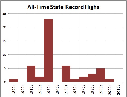
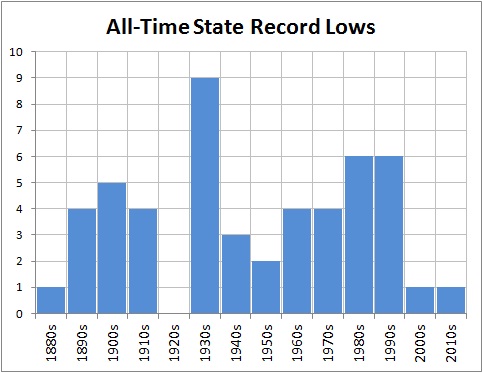
Here by the way is the state all time record highs and lows since 1880s. See any of Cullen or Romm or Meehl’s tipping point runaway warming?


ALSO SEEJun 09, 2012
Records and Extremes

Thanks for this update, Joe D'Aleo.

In order to understand better the significance of these charts, I recommend that you read the whole post from 2-years ago at Climate Science.  Here is an excerpt:

1. The data are not adjusted. They are recognized as valid by NOAA and have not been “corrected” by interpolation with data from other weather station data.
2. They represent the climate “boundaries” for statewide geographies. A record either stands on it’s own or is replaced by a subsequent reading that ties or exceeds it. 
3. It allows testing of the tenet that global warming necessarily results it an increased frequency of temperature extremes. 
Anthony Watts has identified other types of "corrected" data that are avoided in the above data.

2012 IS HERE

..

Can"t Find It?

Use the SEARCH BLOG feature at the upper left. For example, try "Global Warming".

You can also use the "LABELS" below or at the end of each post to find related posts.

Blog Archive

Cost of Gasoline - Enter Your Zipcode or Click on Map

CO2 Cap and Trade

There is always an easy solution to every human problem—neat, plausible, and wrong.
Henry Louis Mencken (1880–1956)
“The Divine Afflatus,” A Mencken Chrestomathy, chapter 25, p. 443 (1949)
... and one could add "not all human problems really are."
It was beautiful and simple, as truly great swindles are.
- O. Henry
... The Government is on course for an embarrassing showdown with the European Union, business groups and environmental charities after refusing to guarantee that billions of pounds of revenue it stands to earn from carbon-permit trading will be spent on combating climate change.
The Independent (UK)

Tracking Interest Rates

Tracking Interest Rates

FEDERAL RESERVE & HOUSING

SEARCH BLOG: FEDERAL RESERVE for full versions... or use the Blog Archive pulldown menu.

February 3, 2006
Go back to 1999-2000 and see what the Fed did. They are following the same pattern for 2005-06. If it ain't broke, the Fed will fix it... and good!
August 29, 2006 The Federal Reserve always acts on old information... and is the only cause of U.S. recessions.
December 5, 2006 Last spring I wrote about what I saw to be a sharp downturn in the economy in the "rustbelt" states, particularly Michigan.
March 28, 2007
The Federal Reserve sees no need to cut interest rates in the light of adverse recent economic data, Ben Bernanke said on Wednesday.
The Fed chairman said ”to date, the incoming data have supported the view that the current stance of policy is likely to foster sustainable economic growth and a gradual ebbing in core inflation”.

July 21, 2007 My guess is that if there is an interest rate change, a cut is more likely than an increase. The key variables to be watching at this point are real estate prices and the inventory of unsold homes.
August 11, 2007 I suspect that within 6 months the Federal Reserve will be forced to lower interest rates before housing becomes a black hole.
September 11, 2007 It only means that the overall process has flaws guaranteeing it will be slow in responding to changes in the economy... and tend to over-react as a result.
September 18, 2007 I think a 4% rate is really what is needed to turn the economy back on the right course. The rate may not get there, but more cuts will be needed with employment rates down and foreclosure rates up.
October 25, 2007 How long will it be before I will be able to write: "The Federal Reserve lowered its lending rate to 4% in response to the collapse of the U.S. housing market and massive numbers of foreclosures that threaten the banking and mortgage sectors."
November 28, 2007 FED VICE CHAIRMAN DONALD KOHN
"Should the elevated turbulence persist, it would increase the possibility of further tightening in financial conditions for households and businesses," he said.

"Uncertainties about the economic outlook are unusually high right now," he said. "These uncertainties require flexible and pragmatic policymaking -- nimble is the adjective I used a few weeks ago."
http://www.reuters.com/

December 11, 2007 Somehow the Fed misses the obvious.
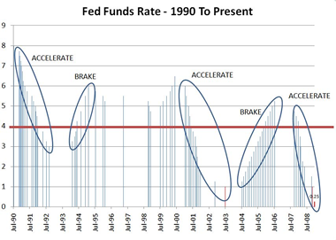
fed_rate_moves_425_small.gif
[Image from: CNNMoney.com]
December 13, 2007 [from The Christian Science Monitor]
"The odds of a recession are now above 50 percent," says Mark Zandi, chief economist at Moody's Economy.com. "We are right on the edge of a recession in part because of the Fed's reluctance to reduce interest rates more aggressively." [see my comments of September 11]
January 7, 2008 The real problem now is that consumers can't rescue the economy and manufacturing, which is already weakening, will continue to weaken. We've gutted the forces that could avoid a downturn. The question is not whether there will be a recession, but can it be dampened sufficiently so that it is very short.
January 11, 2008 This is death by a thousand cuts.
January 13, 2008 [N.Y. Times]
“The question is not whether we will have a recession, but how deep and prolonged it will be,” said David Rosenberg, the chief North American economist at Merrill Lynch. “Even if the Fed’s moves are going to work, it will not show up until the later part of 2008 or 2009.
January 17, 2008 A few days ago, Anna Schwartz, nonagenarian economist, implicated the Federal Reserve as the cause of the present lending crisis [from the Telegraph - UK]:
The high priestess of US monetarism - a revered figure at the Fed - says the central bank is itself the chief cause of the credit bubble, and now seems stunned as the consequences of its own actions engulf the financial system. "The new group at the Fed is not equal to the problem that faces it," she says, daring to utter a thought that fellow critics mostly utter sotto voce.
January 22, 2008 The cut has become infected and a limb is in danger. Ben Bernanke is panicking and the Fed has its emergency triage team cutting rates... this time by 3/4%. ...

What should the Federal Reserve do now? Step back... and don't be so anxious to raise rates at the first sign of economic improvement.
Individuals and businesses need stability in their financial cost structures so that they can plan effectively and keep their ships afloat. Wildly fluctuating rates... regardless of what the absolute levels are... create problems. Either too much spending or too much fear. It's just not that difficult to comprehend. Why has it been so difficult for the Fed?

About Me

My photo
Michigan, United States
Air Force (SAC) captain 1968-72. Retired after 35 years of business and logistical planning, including running a small business. Two sons with advanced degrees; one with a business and pre-law degree. Beautiful wife who has put up with me for 4 decades. Education: B.A. (Sociology major; minors in philosopy, English literature, and German) M.S. Operations Management (like a mixture of an MBA with logistical planning)